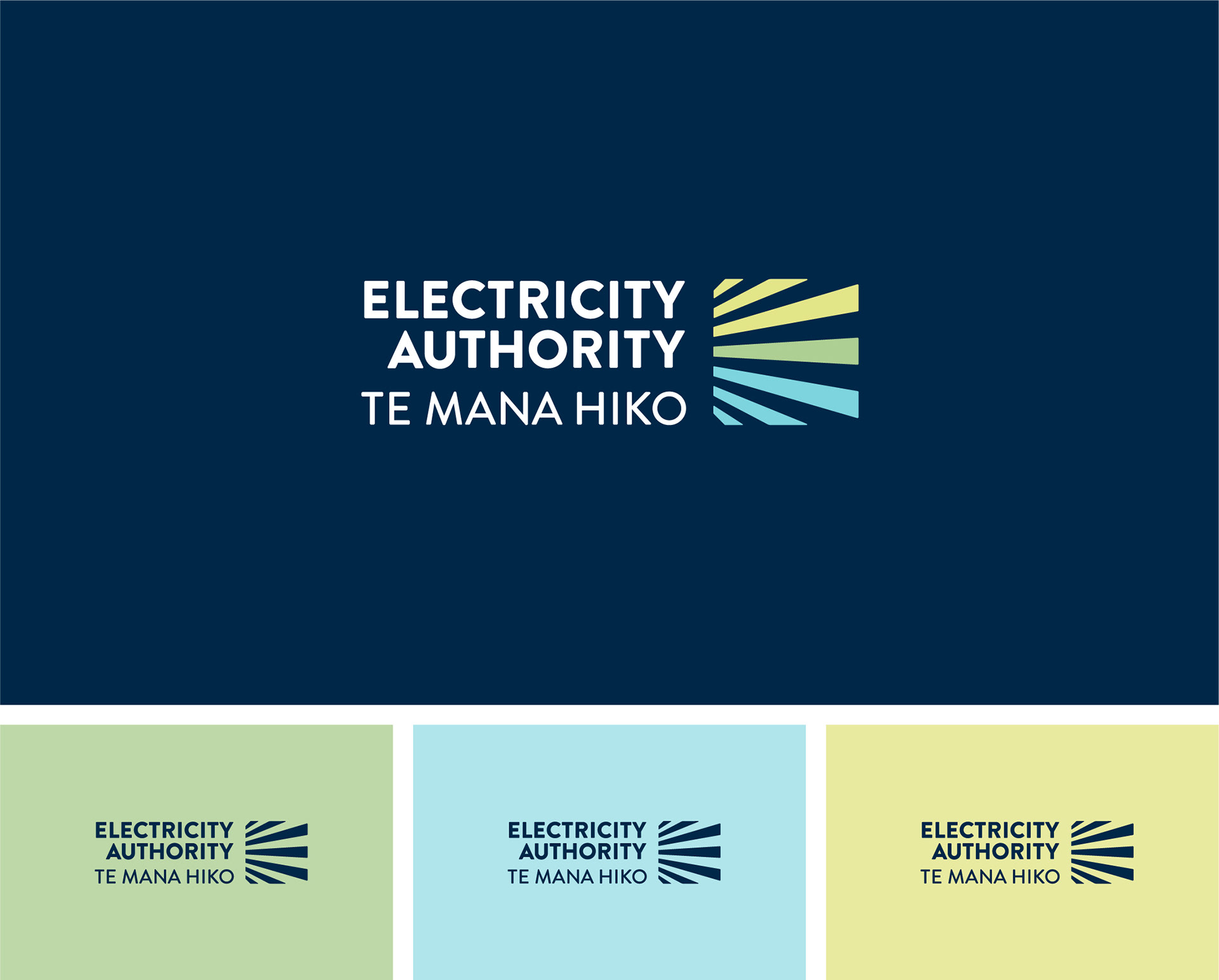
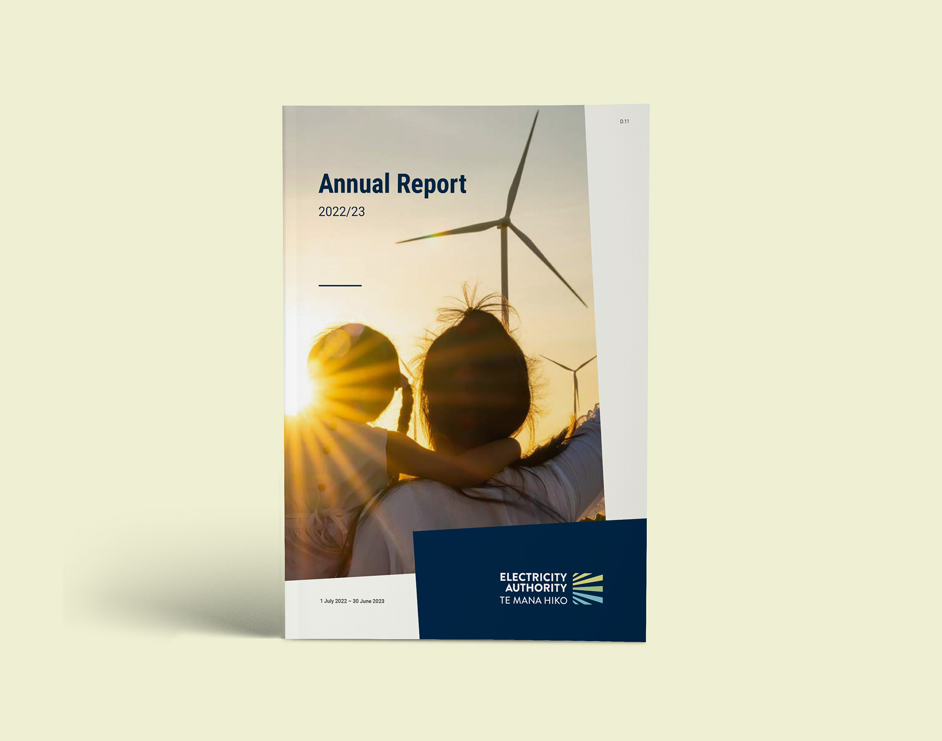
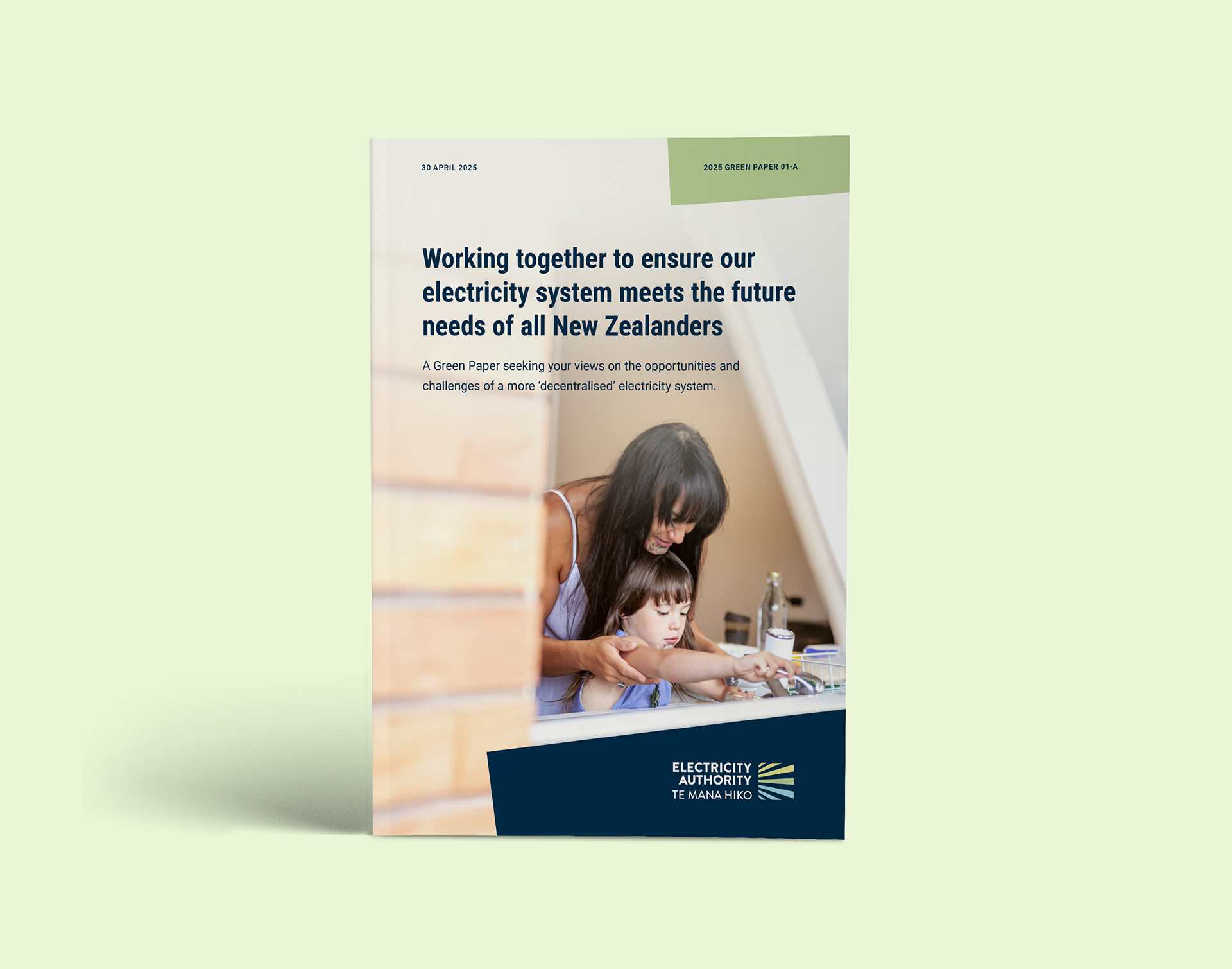
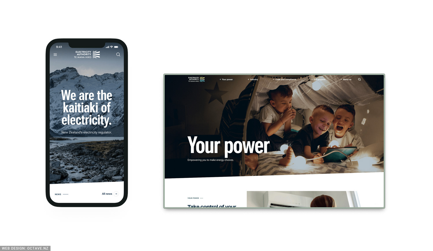
A brand refresh and design system for the for New Zealand’s electricity sector regulator. Sharp enough for the corporate world but warm enough to connect with consumers : professional and approachable.
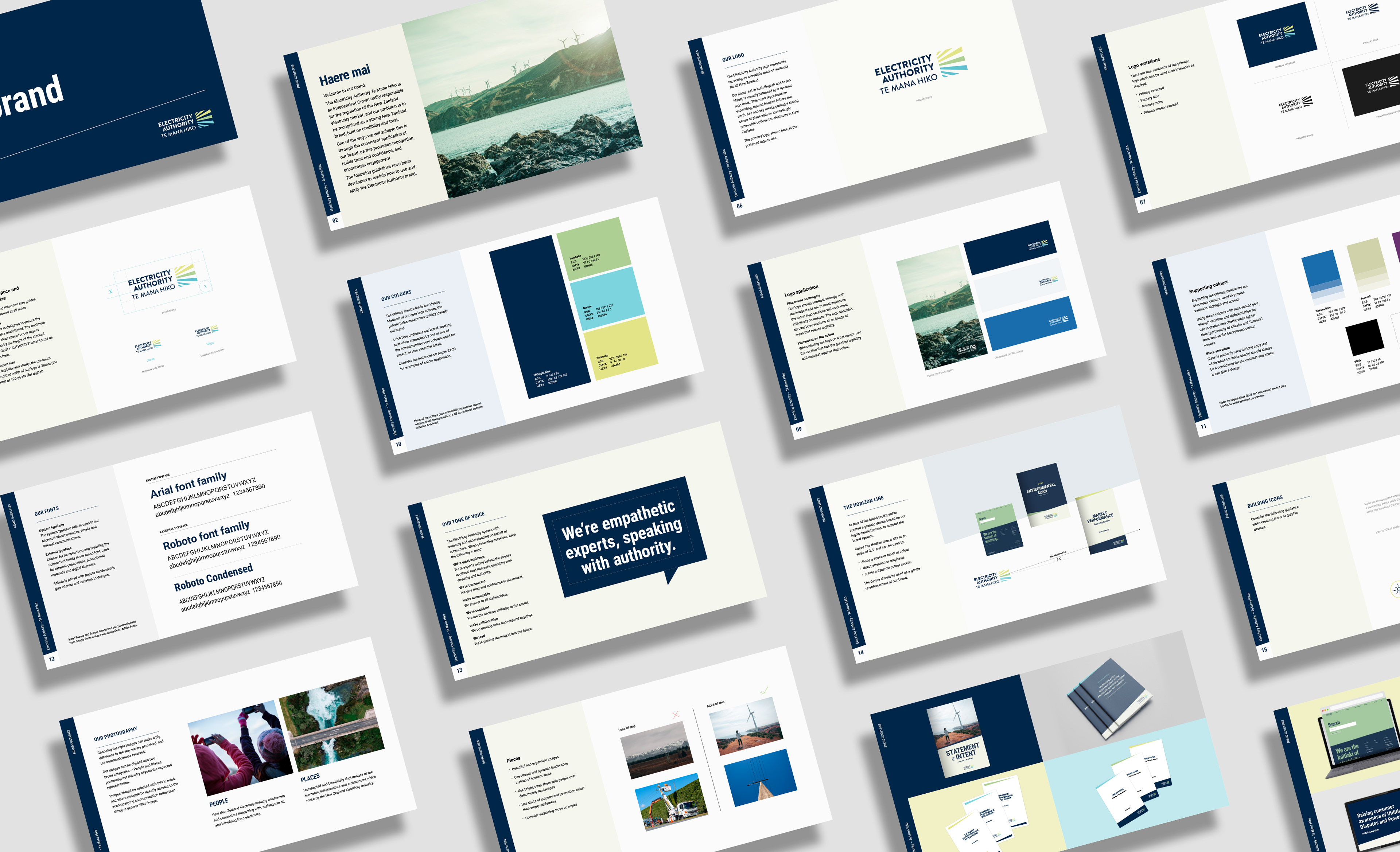
• Comprehensive Brand Guidelines
• Templated documents for internal use
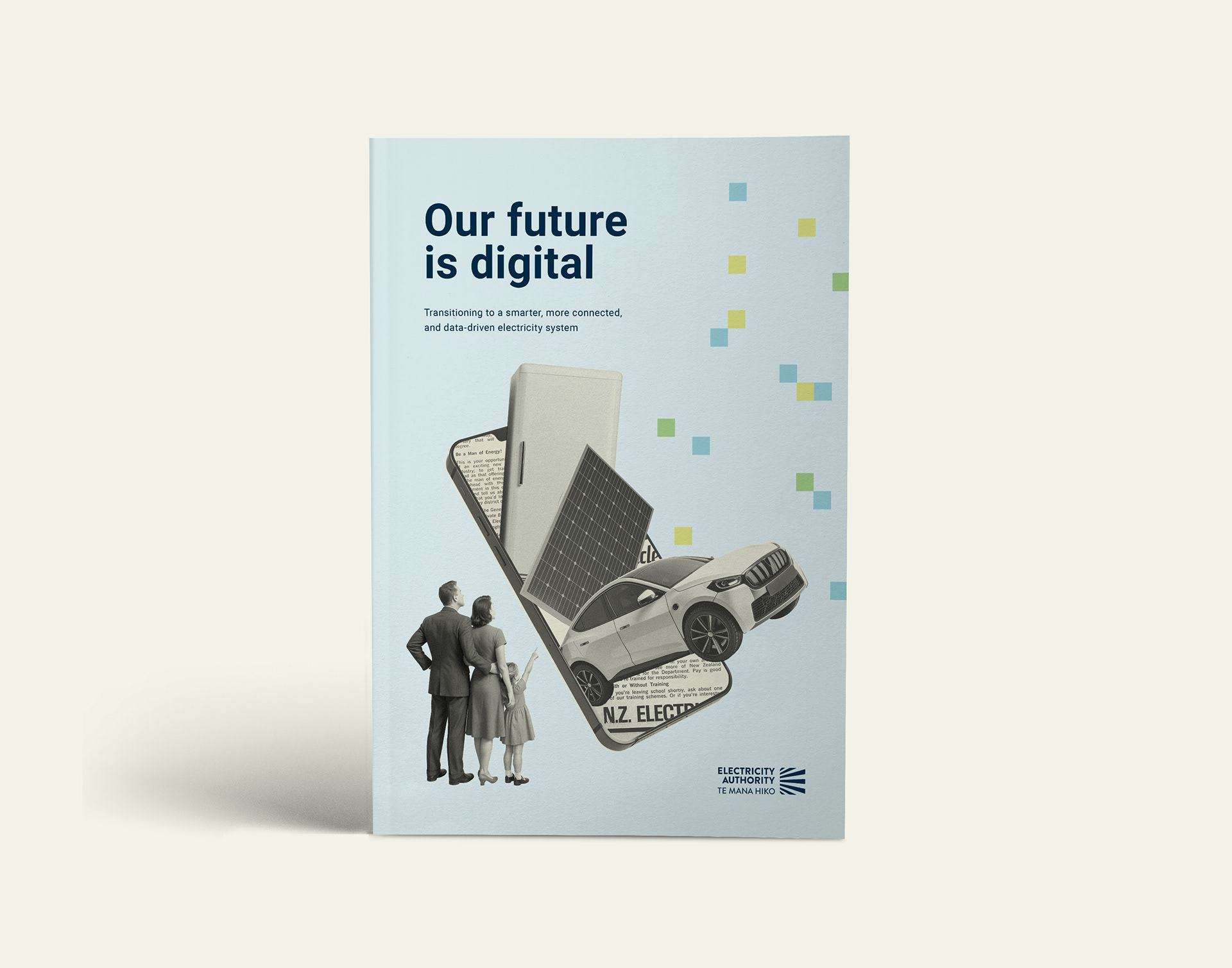
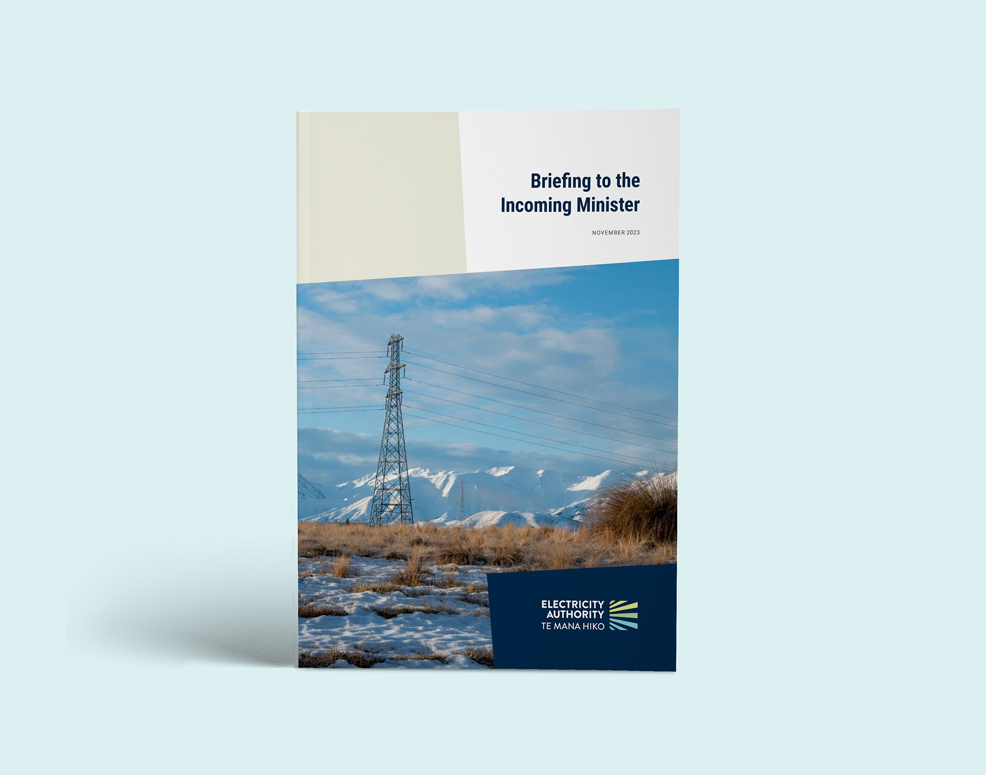
• Annual Reports, briefing and public-facing documents
• Digital assets, such as email footers, headers and web-banners.
• Templated documents for internal use
• Annual Reports, briefing and public-facing documents
• Digital assets, such as email footers, headers and web-banners.