THE OBJECTIVE
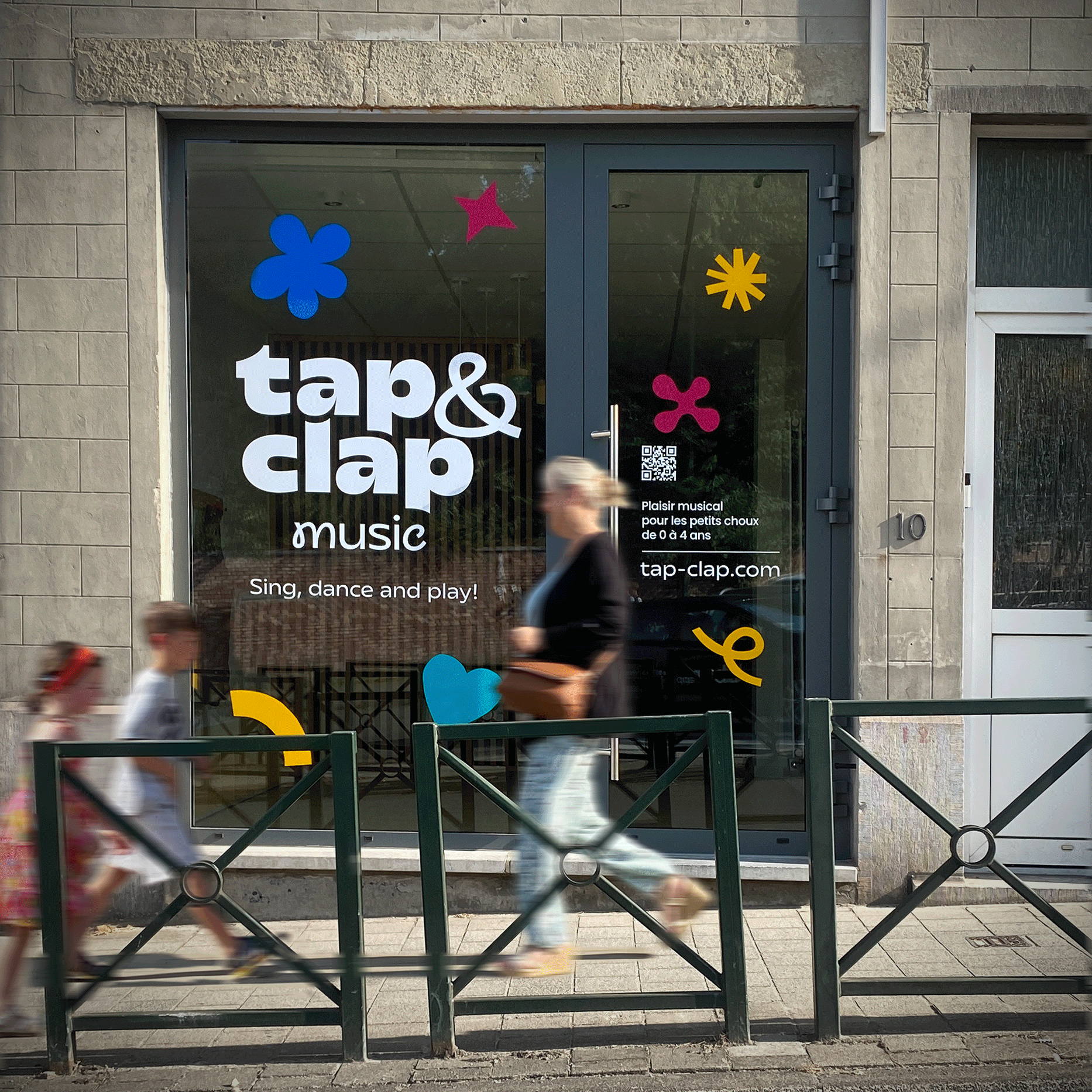
Hidden in plain site on a busy intersection, Tap and Clap's music school was easy to miss. With an impractical logo and an empty shop window, they wanted a fun identity that would turn heads, adding playful energy and real street presence to their brand.
THE OUTCOME
A versatile lock-up, combined with a vibrant brand refresh gave the identity new energy and delivered greater presence and brand recognition. The window graphic, with accompanying positioning statement, was designed for maximum legibility whether viewed from two metres or twenty – driving an immediate uplift in website traffic.